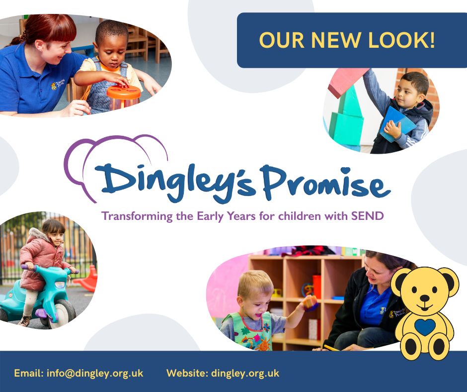
Dingley’s Promise is pleased to introduce our new charity logo! We have kept our recognisable “Dingley’s Promise” font and our updated strapline emphasises our passion and commitment to “Transform the Early Years for children with SEND”.
Along with our new logo, our charity branding has also been given a refresh. We’ve spruced up our signature colours and revised our brand guidelines to ensure our appearance stays fresh, professional and welcoming to all, from families to funders.
Our much-loved Dingley Bear mascot is here to stay too and will be featured across much of our branded materials, especially when messages refer to our three centres or communicates directly to children and families.
Our design development has been achieved through the collaboration of Dingley’s Promise team and Abstract Creative Studio. Our talented designer Rebecca was with us every step of the way and was instrumental in helping us make our new vision for the charity a reality.
“We love our new logo and refreshed branding because of its fresh new look that combines both our friendly, local image in line with our direct work with children and families, but also brings in our wider role of transforming the early years sector for children across the country. As a charity we are moving forward to make a greater impact than ever before, and we really feel that our new branding captures that.’ – Catherine McLeod, CEO of Dingley’s Promise


